UX & UI Design
A/B testing
Usability Testing
Prototyping
Web
iOS

01 BACKGROUND
New Website launched - What now?
Following the 2021 merger, Virgin Media and O2 (VMO2) launched a new dual-branded website, serving over 47 million customers.
Early sales results revealed potential for growth, prompting the need to optimise the site for improved page progression, higher conversions, and an enhanced overall customer experience.

Screenshot from https://news.virginmediao2.co.uk/
Boost sales & conversion
The business goal for VMO2 was clear from the start: to drive sales and enhance conversion rates for our dual-branded offerings. To tackle this, we aimed not only to improve immediate sales figures but also to foster long-term customer loyalty and satisfaction.
03 CHALLENGES
Varied customer segments and complex stakeholders
The merger of VM and O2 adds complexity to user segmentation by establishing four distinct groups:

Two-Phased Approach
We applied a two-phased approach to drive sales and conversions. Phase 1 focused on reviewing existing research and site performance, while Phase 2 centred on designing, testing, and optimising to identify the best-performing solution.

During Phase 1, I played a pivotal role in thoroughly exploring the problem space before moving into solutioning.
My focus was on engaging key stakeholders, extracting valuable insights, and aligning the team with user needs. Here’s a summary of three key activities I led:
Facilitating Stakeholder Workshops
I facilitated 3 workshops (virtual due to pandemic) with 8 key stakeholders (Product Lead, Design Lead , Marketing Lead and Legal Reps) to define our strategic direction and ideate on gaps for improvements.
Output: a full backlog of test ideas, problem statements and hypotheses to be tested in phase 2.

Workshop Mural board (left) and test backlog (right) developed during Phase 1 to align stakeholders and guide testing strategy (blurred for confidentiality).
Data-driven Insights & Personas
I analysed 15+ user research reports and worked with our data analyst to integrate site performance insights, ensuring data-backed conclusions.
Output: Developed 4 personas and fostered team alignment on design principles through sessions with the Product Manager and FE Developer.

4 Personas developed based on User Research Insights
Mapping User Flows for Alignment
I mapped user flows to visualise the entire user journey in scope, helping the team identify pain points and design more intuitive, seamless experience.
Output: Secured key stakeholder buy-in and team alignment ready for the testing phase.

With the discovery foundation laid in Phase 1, Phase 2 focused on iterative A/B testing. We followed an adaptable design process, allowing us to experiment, gather data, and identify the best-performing solutions. The process evolved as new insights or business needs emerged.

Our Proejct Design Process


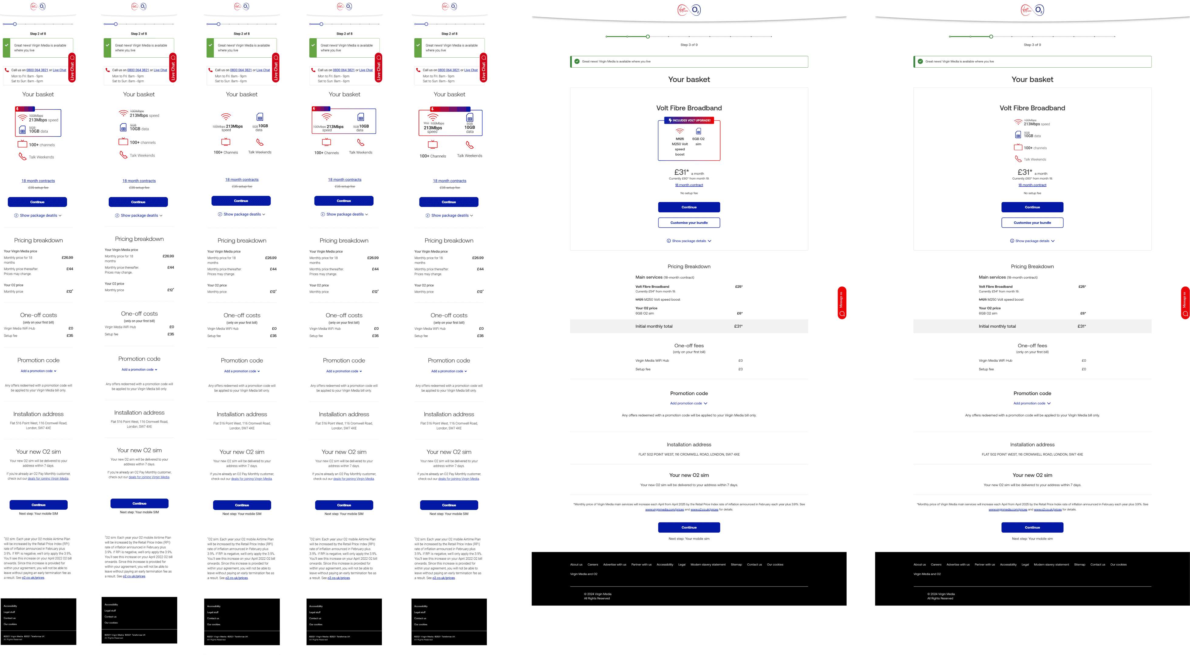
Test Build & Launch
I handed over the design to the front-end developer for implementation in Google Optimize (sunset in 2023), providing detailed specs and interaction guidelines through Figma (plus multiple rounds of design quality checks).


Test 5 Results
IT’S A WIN! This test ran for 14 days, reaching a total of 5,361 users (56% mobile, 41% desktop). The test variant outperformed the control, showing improved progression to the next page and increased sales conversion.

05 OUTCOME
What we delivered
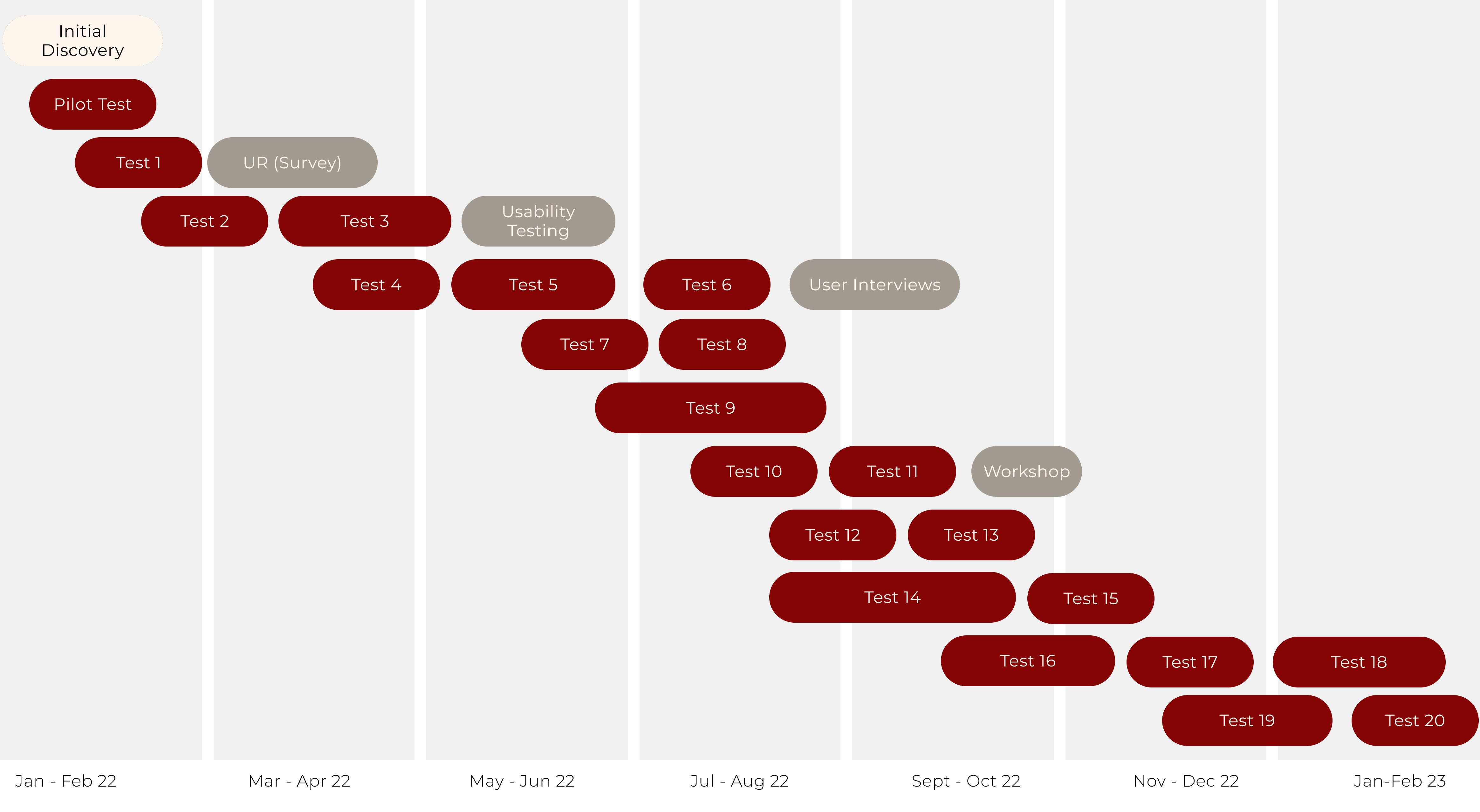
Over the course of 14 months, we launched 20 tests, reaching over 41K customers across the UK and Europe. Most tests ran for 14 days, some required more time to reach significance. For certain tests, we conducted user research to assess results and followed up with iterative tests to refine outcomes.
Test Design Selection


Our Impact
06 Reflection
My Learnings
How to best work with developers
After trying various handover methods, I found quick calls worked best for communicating designs to developers. We had some miscommunication early on, but we built a strong rapport over time. By the end, we were even discussing how to decode Apple’s landing pages!
Never underestimate simplicity
I’ve learned that the best-performing tests don’t always involve complex design changes. In one test, simply removing a toggle led to great results. It’s a reminder that understanding user pain points is crucial.
The design process is rarely linear
The design process is rarely linear. It’s about constant iteration and refinement. While guidelines are helpful, I’ve developed the ability to stay flexible and focus on delivering the most value, adapting as needed.