How Our Redesign Improved COVID-19 Test and Trace Services
NHS | Product Designer | 2022 - 2023

TL;DR: Our team streamlined 30+ NHS COVID-19 Test and Trace web services, reducing operational costs by 50% while swiftly adapting to evolving policy requirements.
TL;DR: Our team streamlined 30+ NHS COVID-19 Test and Trace web services, reducing operational costs by 50% while swiftly adapting to evolving policy requirements.
TL;DR: Our team streamlined 30+ NHS COVID-19 Test and Trace web services, reducing operational costs by 50% while swiftly adapting to evolving policy requirements.
TL;DR: Our team streamlined 30+ NHS COVID-19 Test and Trace web services, reducing operational costs by 50% while swiftly adapting to evolving policy requirements.
MY ROLE
MY ROLE
MY ROLE
MY ROLE
Interaction Design
User Research
Prototyping (HTML & CSS)
Service Design
Interaction Design
User Research
Prototyping (HTML & CSS)
Service Design
Interaction Design
User Research
Prototyping (HTML & CSS)
Service Design
Interaction Design
User Research
Prototyping (HTML & CSS)
Service Design
TEAM
TEAM
TEAM
TEAM
2x Service Designer
1x Product Designer (me)
3x Content Designer
3x User Researcher
2x Service Designer
1x Product Designer (me)
3x Content Designer
3x User Researcher
2x Service Designer
1x Product Designer (me)
3x Content Designer
3x User Researcher
2x Service Designer
1x Product Designer (me)
3x Content Designer
3x User Researcher
IMPACT
IMPACT
IMPACT
IMPACT
130+ Screens Enhanced
Millions Users Reached
20%+ Cost Reduction
130+ Screens Enhanced
Millions Users Reached
20%+ Cost Reduction
130+ Screens Enhanced
Millions Users Reached
20%+ Cost Reduction
130+ Screens Enhanced
Millions Users Reached
20%+ Cost Reduction
01 BACKGROUND
In 2022, as the UK transitioned from pandemic to endemic management of COVID-19, the NHS Test and Trace programme needed to adapt to government's 'Living with COVID-19' strategy.
This shift required a reduction in testing service costs, while continuing to protect vulnerable individuals.
Going from pandemic to endemic

Graph source: https://stock.adobe.com/uk/search?filters%5Bcontent_type
02 BUSINESS GOAL
With the end of free mass testing for all citizens and in alignment with the policy at the time, there was a need to reduce service running costs while ensuring they could be swiftly reactivated in the event of future outbreaks or pandemics.
Reduce expenses and retain agility
Reduce expenses and retain agility
01 BACKGROUND
In 2022, as the UK transitioned from pandemic to endemic management of COVID-19, the NHS Test and Trace programme needed to adapt to government's 'Living with COVID-19' strategy.
This shift required a reduction in testing service costs, while continuing to protect vulnerable individuals.
Going from pandemic to endemic
Going from pandemic to endemic
03 USERS
Unlike my previous commercial projects with defined audiences, this NHS project required designing for a broad, diverse user base. The service needed to be accessible to everyone with a strong focus on inclusivity, simplicity, and usability, aligning with WCAG standards to ensure accessibility across all user needs.
Design for All
Together with the user researcher on the team, I conducted 20 user interviews to understand the needs and pain points of Test and Trace users.
While we were unable to interview someone with a visual impairment within the timeline, we successfully spoke with individuals with health conditions and autism. I created these personas based on those conversations, ensuring broad user perspectives.
Who's the service for?
Who's the service for?
Who's the service for?

User Personas
We identified and summarised our key findings into four user needs, which, along with the personas, served as anchor points for our design activities.
What are the user needs?
What are the user needs?
What are the user needs?

Clarity, Simplicity
Users need clear, easy-to-follow instructions with minimal steps.
Users need clear, easy-to-follow instructions with minimal steps.
Users need clear, easy-to-follow instructions with minimal steps.

Reassurance and Trust
Users expect secure handling of personal data, authoritative information.
Users expect secure handling of personal data, authoritative information.
Users expect secure handling of personal data, authoritative information.

Support for Vulnerable Users
Such as the elderly, less tech-savvy individuals, and people with visual disabilities.
Such as the elderly, less tech-savvy individuals, and people with visual disabilities.
Such as the elderly, less tech-savvy individuals, and people with visual disabilities.

Speed and Efficiency
The service should be fast and responsive, providing latest pandemic updates.
The service should be fast and responsive, providing latest pandemic updates.
The service should be fast and responsive, providing latest pandemic updates.
Key User Research Findings on Needs
04 PROBLEM SPACE
How might we reduce costs while still advocating for the best user experience in COVID-19 testing?
How might we reduce costs while still advocating for the best user experience in COVID-19 testing?
How might we reduce costs while still advocating for the best user experience in COVID-19 testing?
How might we reduce costs while still advocating for the best user experience in COVID-19 testing?

05 MY KEY CONTRIBUTION
My redesign reduced admin costs and lifted test success rate to 98.9%
My redesign reduced admin costs and lifted test success rate to 98.9%
1. What is the design about?
What is the design
The NHS Test and Trace portal asks users to upload a photo of their test results, as the AI-powered digital reader can detect positive results that may be missed by the human eye.
This provides users with more accurate outcomes than relying solely on human interpretation, easing the burden on users who may be uncertain about reading their test results correctly.
Over 20% of test result images are not correctly interpreted by the system due to poor photo quality. This increases the administrative workload and leads to user frustration.
What problem am I solving


Mockup of the Original Instruction Page
The NHS Test and Trace portal asks users to upload a photo of their test results, as the AI-powered digital reader can detect positive results that may be missed by the human eye.
This provides users with more accurate outcomes than relying solely on human interpretation, easing the burden on users who may be uncertain about reading their test results correctly.
What is the design

In the performance report I noticed that over 20% of test result images are not correctly interpreted by the system due to poor photo quality. This increases the administrative workload and leads to user frustration.
What problem am I solving?
How might we reduce user errors when taking photos of test results?
How might we reduce user errors when taking photos of test results?
How might we reduce user errors when taking photos of test results?
How might we reduce user errors when taking photos of test results?

Hover over the design below to see issues identified.
Working on the NHS website required strict adherence to design systems and standards, so I conducted a heuristic evaluation of the existing page design. I also drew valuable insights from previous usability testing conducted for the entire user journey.
What isn't working in the current design?
What's not working in the current design
What's not working in the current design
Hover over the design below to see issues identified.

Hover over to see how I translated these insights into the initial 'Dos' and 'Don'ts' list for my first design iteration.
To shape my design solution, I joined the weekly tech team call where they reviewed void test upload images to identify common user mistakes.
How my design solution took shape


Mockup of the Original Instruction Page
How my design solution took shape
Hover over to see how I translated these insights into the initial 'Dos' and 'Don'ts' list for my first design iteration.
To shape my design solution, I joined the weekly tech team call where they reviewed void test upload images to identify common user mistakes.
To shape my design solution, I joined the weekly tech team call where they reviewed void test upload images to identify common user mistakes.
How my design solution took shape
Hover over to see how I translated these insights into the initial 'Dos' and 'Don'ts' list for my first design iteration.
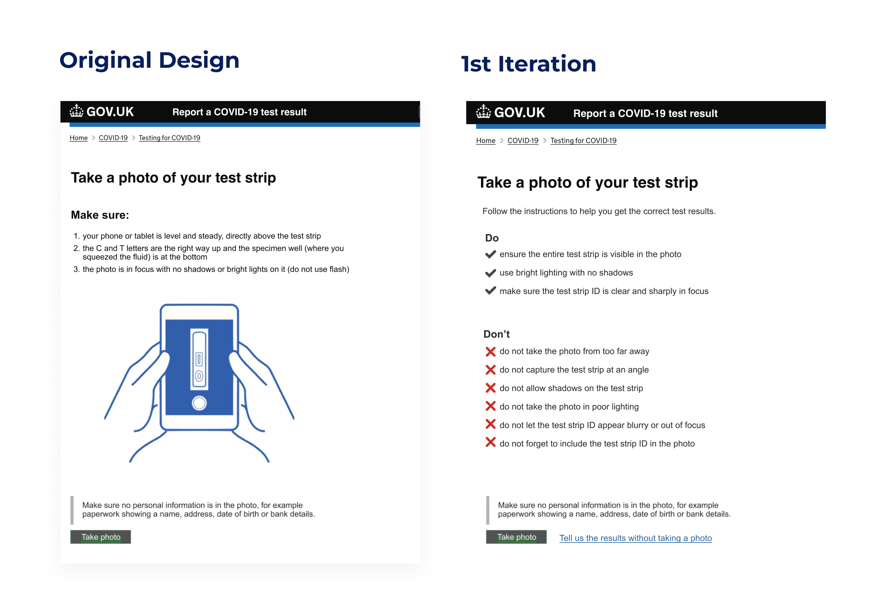

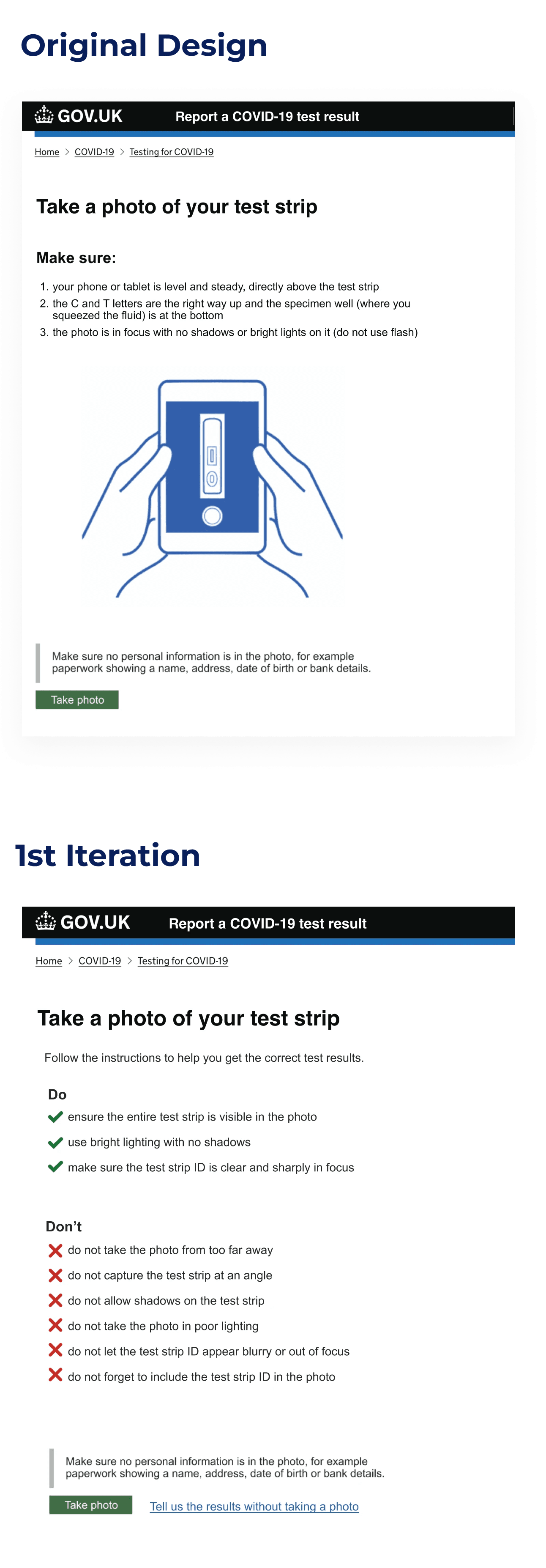
Original vs. First Iteration
Original vs. First Iteration
Original vs. First Iteration
First Iteration Limitations
Time Constraints
Time Constraints
Time Constraints
Content Team Availability
Content Team Availability
Content Team Availability
Base for Early Feedback
Base for Early Feedback
Base for Early Feedback
I developed the first iteration quickly to meet a tight project timeline, prioritising functionality and usability over extensive refinement.
I developed the first iteration quickly to meet a tight project timeline, prioritising functionality and usability over extensive refinement.
I developed the first iteration quickly to meet a tight project timeline, prioritising functionality and usability over extensive refinement.
Due to limited capacity in the content team, this iteration relied heavily on text and lacked supporting visuals that could improve clarity.
Due to limited capacity in the content team, this iteration relied heavily on text and lacked supporting visuals that could improve clarity.
Due to limited capacity in the content team, this iteration relied heavily on text and lacked supporting visuals that could improve clarity.
I prioritised having a workable version to gather internal feedback before the formal usability testing phase, so I can have targeted improvements in the next iteration.
I prioritised having a workable version to gather internal feedback before the formal usability testing phase, so I can have targeted improvements in the next iteration.
I prioritised having a workable version to gather internal feedback before the formal usability testing phase, so I can have targeted improvements in the next iteration.

Before conducting full-scale testing, I carried out a small internal usability test to gather timely feedback. Below are my key takeaways that directly influenced my second interation.
Testing Feedback to Iteration

The internal usability testing allowed me to make informed design adjustments and secure buy-in from the content team on creating visuals to help users understand how to take an accurate photo. I also referenced the ‘Take a Photo’ design pattern from the UK passport service as inspiration, ensuring adherence to GOV.UK design standards.
Hover over the image below to explore the updates made in the second iteration and the rationale behind each change.
Crafting the 2nd iteration


Too Text-Heavy
While the design met WCAG compliance, the amount of text should be reduced.
While the design met WCAG compliance, the amount of text should be reduced.
While the design met WCAG compliance, the amount of text should be reduced.

Lacking Visuals
After the review, the content team recognised the importance and committed to creating them.
After the review, the content team recognised the importance and committed to creating them.
After the review, the content team recognised the importance and committed to creating them.

Header Updates Needed
User now have the option to submit results without a photo so a revised header should reflect this alternative option.
User now have the option to submit results without a photo so a revised header should reflect this alternative option.
User now have the option to submit results without a photo so a revised header should reflect this alternative option.
Internal Usability Testing Insights
The internal usability testing allowed me to make informed design adjustments and secure buy-in from the content team on creating visuals to help users understand how to take an accurate photo. I also referenced the ‘Take a Photo’ design pattern from the UK passport service as inspiration, ensuring adherence to GOV.UK design standards.
Hover over the image below to explore the updates made in the second iteration and the rationale behind each change.
Crafting the 2nd iteration

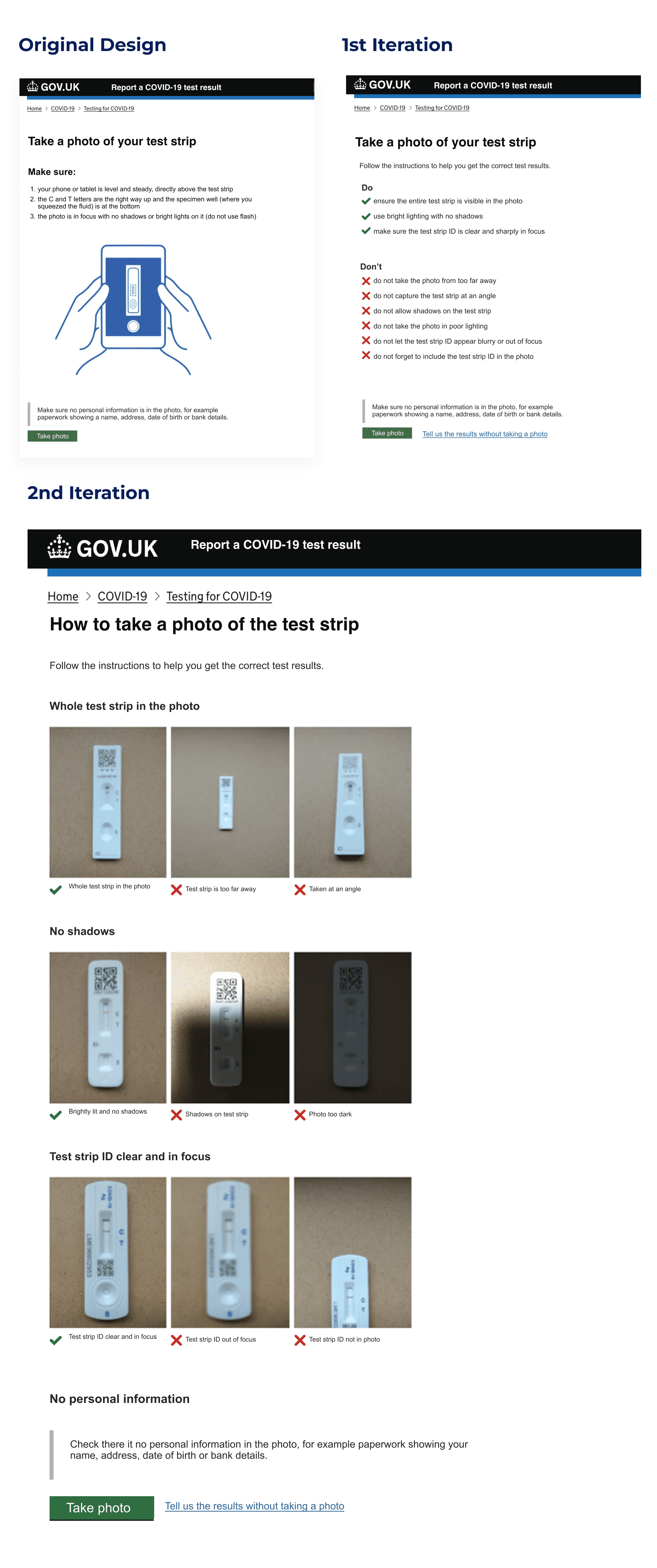
Design evolution (original vs. iterations)


How my final design hit the mark
How this design hit the mark
How this design hit the mark
A Clear Win! We started with A/B testing for the new design and, after seeing strong results, proceeded with a full rollout.
This iteration achieved a significant 12.1% increase in success rate. By reducing incorrect submissions, this design not only improved user experience but also decreased backend system burden, freeing up resources and lowering NHS administrative costs.
06 IMPACTS
We formed a multidisciplinary team—including service designers, product designers, content designers, and user researchers and collaborated closely with the NHS design team, bringing together diverse expertise to strengthen the overall effort.
What our team delivered
What our team delivered
Mapped Out E2E Current Services
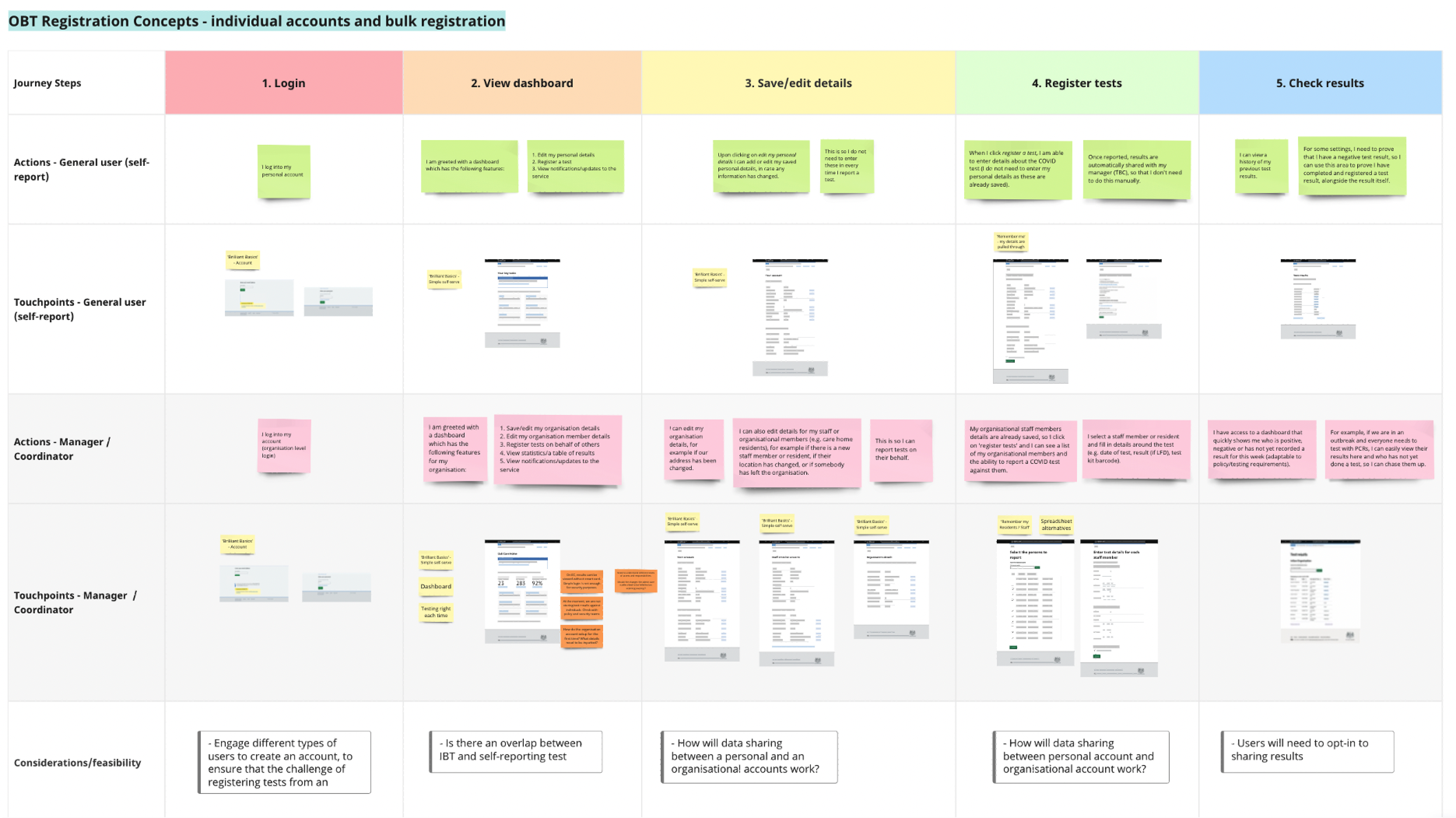
I supported service design by mapping the end-to-end user experience into flows and service blueprints, creating a single source of truth for guiding design and decision-making.
Mapped Out E2E Current Services
I supported service design by mapping the end-to-end user experience into flows and service blueprints, creating a single source of truth for guiding design and decision-making.
Conducted Continuous User Research
I supported service design by mapping the end-to-end user experience into flows and service blueprints, creating a single source of truth for guiding design and decision-making.

End-to-end Service Blueprint (blurred for confidentiality)
Created accessible design and prototypes
We translated user and business requirements into accessible, user-friendly journeys, following NHS Service Standards. I used my front-end development skills to build prototypes for discovery research, usability testing, and pre-delivery handoff.
Conducted Continuous User Research
I voluntarily supported our user research team by drafting discussion guides, taking notes during remote interviews, and coding HTML prototypes for usability testing.
Conducted Continuous User Research
I voluntarily supported our user research team by drafting discussion guides, taking notes during remote interviews, and coding HTML prototypes for usability testing.
Note taking board for user research and synthesis (blurred for confidentiality)
Created accessible design and prototypes
We translated user and business requirements into accessible, user-friendly journeys, following NHS Service Standards. I used my front-end development skills to build prototypes for discovery research, usability testing, and pre-delivery handoff.
Created accessible design and prototypes
We translated user and business requirements into accessible, user-friendly journeys, following NHS Service Standards. I used my front-end development skills to build prototypes for discovery research, usability testing, and pre-delivery handoff.

Figma design workspace for team collaboration
Over our 12-month engagement, we reduced costs and prioritized high-impact activities with a strong return on investment. While specific details are protected due to privacy and disclosure requirements, our efforts notably enhanced services for vulnerable user groups and those at high risk of severe illness from COVID-19.

Results


Screen recording of part of the Test & Trace Services
07 REFLECTION
This project has been one of the most inspiring experiences of my career. Initially, I saw the GOV.UK website’s design as straightforward, even ‘boring.’ But as I dove into sessions observing users with accessibility needs—especially one participant with a visual impairment navigating with a digital reader—I came to understand the depth and importance behind each design choice. Witnessing how even small elements, like an input box, could lead to frustration, I gained a new perspective on accessibility and simplicity. This project taught me the true value of design’s role in empowering all users, a lesson I will carry forward.
My Learnings
How Our Redesign Improved COVID-19 Test and Trace Services
NHS | Product Designer | 2022 - 2023
TL;DR: Our team streamlined the NHS COVID-19 Test and Trace web services, reducing operational costs while swiftly adapting to evolving policy requirements.
MY ROLE
Interaction Design
User Research
Prototyping (HTML & CSS)
Service Design
TEAM
2x Service Designer
1x Product Designer (me)
3x Content Designer
3x User Researcher
IMPACT
130+ Screens Enhanced
Millions Users Reached
20%+ Cost Reduction
01 BACKGROUND
In 2022, as the UK transitioned from pandemic to endemic management of COVID-19, the NHS Test and Trace programme needed to adapt to government's 'Living with COVID-19' strategy.
This shift required a reduction in testing service costs, while continuing to protect vulnerable individuals.
Going from pandemic to endemic
Graph source: https://stock.adobe.com/uk/search?filters%5Bcontent_type
02 BUSINESS GOAL
With the end of free mass testing for all citizens and in alignment with the policy at the time, there was a need to reduce service running costs while ensuring they could be swiftly reactivated in the event of future outbreaks or pandemics.
Reduce expenses and retain agility
03 USERS
Unlike my previous commercial projects with defined audiences, this NHS project required designing for a broad, diverse user base. The service needed to be accessible to everyone with a strong focus on inclusivity, simplicity, and usability, aligning with WCAG standards to ensure accessibility across all user needs.
Design for All
Together with the user researcher on the team, I conducted 20 user interviews to understand the needs and pain points of Test and Trace users.
While we were unable to interview someone with a visual impairment within the timeline, we successfully spoke with individuals with health conditions and autism. I created these personas based on those conversations, ensuring broad user perspectives.
Who's the service for?
User Personas
We identified and summarised our key findings into four user needs, which, along with the personas, served as anchor points for our design activities.
What are the user needs?
Clarity, Simplicity
Users need clear, easy-to-follow instructions with minimal steps.
Reassurance and Trust
Users expect secure handling of personal data, authoritative information.
Support for Vulnerable Users
Such as the elderly, less tech-savvy individuals, and people with visual disabilities.
Speed and Efficiency
The service should be fast and responsive, providing latest pandemic updates.
Key User Research Findings on Needs
04 PROBLEM SPACE
How might we reduce costs while still advocating for the best user experience in COVID-19 testing?
05 MY KEY CONTRIBUTION
My redesign reduced admin costs and lifted test success rate to 98.9%
The NHS Test and Trace portal asks users to upload a photo of their test results, as the AI-powered digital reader can detect positive results that may be missed by the human eye.
This provides users with more accurate outcomes than relying solely on human interpretation, easing the burden on users who may be uncertain about reading their test results correctly.
What is the design
Mockup of the Original Instruction Page
Over 20% of test result images are not correctly interpreted by the system due to poor photo quality. This increases the administrative workload and leads to user frustration.
What problem am I solving
How might we reduce user errors when taking photos of test results?
Working on the NHS website required strict adherence to design systems and standards, so I conducted a heuristic evaluation of the existing page design. I also drew valuable insights from previous usability testing conducted for the entire user journey.
Working on the NHS website required strict adherence to design systems and standards, so I conducted a heuristic evaluation of the existing page design. I also drew valuable insights from previous usability testing conducted for the entire user journey.
What's not working in the current design

Hover over the design below to see issues identified.
Mockup of the Original Instruction Page
To shape my design solution, I joined the weekly tech team call where they reviewed void test upload images to identify common user mistakes.
How my design solution took shape
Hover over to see how I translated these insights into the initial 'Dos' and 'Don'ts' list for my first design iteration.
Original vs. First Iteration
First Iteration Limitations
Time Constraints
Content Team Availability
Base for Early Feedback
I developed the first iteration quickly to meet a tight project timeline, prioritising functionality and usability over extensive refinement.
Due to limited capacity in the content team, this iteration relied heavily on text and lacked supporting visuals that could improve clarity.
I prioritised having a workable version to gather internal feedback before the formal usability testing phase, so I can have targeted improvements in the next iteration.
Before conducting full-scale testing, I carried out a small internal usability test to gather timely feedback. Below are my key takeaways that directly influenced my second interation.
Testing Feedback to Iteration
Too Text-Heavy
While the design met WCAG compliance, the amount of text should be reduced.
Lacking Visuals
After the review, the content team recognised the importance and committed to creating them.
Header Updated Needed
User now have the option to submit results without a photo so a revised header should reflect this alternative option.
Internal Usability Testing Insights
The internal usability testing allowed me to make informed design adjustments and secure buy-in from the content team on creating visuals to help users understand how to take an accurate photo. I also referenced the ‘Take a Photo’ design pattern from the UK passport service as inspiration, ensuring adherence to GOV.UK design standards.
Hover over the image below to explore the updates made in the second iteration and the rationale behind each change.
Crafting the 2nd iteration
Design evolution (original vs. iterations)
A Clear Win! We started with A/B testing for the new design and, after seeing strong results, proceeded with a full rollout.
This iteration achieved a significant 12.1% increase in success rate. By reducing incorrect submissions, this design not only improved user experience but also decreased backend system burden, freeing up resources and lowering NHS administrative costs.
How this design hit the mark
06 IMPACTS
We formed a multidisciplinary team—including service designers, product designers, content designers, and user researchers and collaborated closely with the NHS design team, bringing together diverse expertise to strengthen the overall effort.
What our team delivered
Mapped Out E2E Current Services
I supported service design by mapping the end-to-end user experience into flows and service blueprints, creating a single source of truth for guiding design and decision-making.
End-to-end Service Blueprint (blurred for confidentiality)
Conducted Continuous User Research
I voluntarily supported our user research team by drafting discussion guides, taking notes during remote interviews, and coding HTML prototypes for usability testing.
Note taking board for user research and synthesis (blurred for confidentiality)
Created accessible design and prototypes
We translated user and business requirements into accessible, user-friendly journeys, following NHS Service Standards. I used my front-end development skills to build prototypes for discovery research, usability testing, and pre-delivery handoff.
Figma design workspace for team collaboration
Over our 12-month engagement, we reduced costs and prioritized high-impact activities with a strong return on investment. While specific details are protected due to privacy and disclosure requirements, our efforts notably enhanced services for vulnerable user groups and those at high risk of severe illness from COVID-19.
Results
Screen recording of part of the Test & Trace Services
07 REFLECTION
This project has been one of the most inspiring experiences of my career. Initially, I saw the GOV.UK website’s design as straightforward, even ‘boring.’ But as I dove into sessions observing users with accessibility needs—especially one participant with a visual impairment navigating with a digital reader—I came to understand the depth and importance behind each design choice. Witnessing how even small elements, like an input box, could lead to frustration, I gained a new perspective on accessibility and simplicity. This project taught me the true value of design’s role in empowering all users, a lesson I will carry forward.